Warning
This is a page in draft and has not yet been edited or approved
Iconography
Icons are the visual symbols to represent ideas, actions and objects to enhance the findability, recognition, Information scent and attractiveness
In iconography for web design and apps, well-designed iconic symbols are vital cues for how a user interacts with a user interface (UI). The importance of icons for digital interfaces becomes even more apparent when one considers the relationship between a signifier and affordances in the physical world.
Design
Foundation
The square grid is the underlying fabric of all Progress Infra icons and is used as the foundation to determine line thickness, proportion, shape and positioning across the entire set of icons. The grid helps guide design decisions, which helps ensure a unified approach. More importantly, it allows flexibility in creating the appropriate shape needed to communicate the right idea.
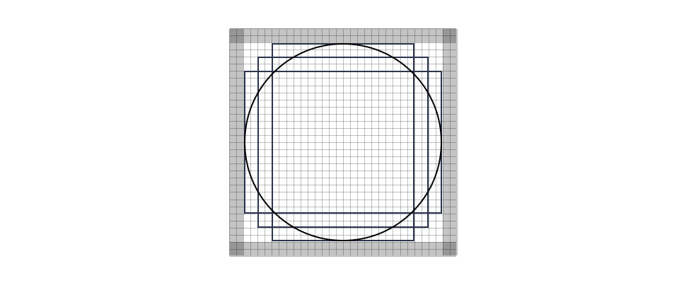
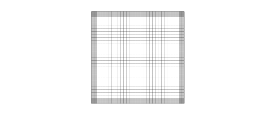
Base Grid
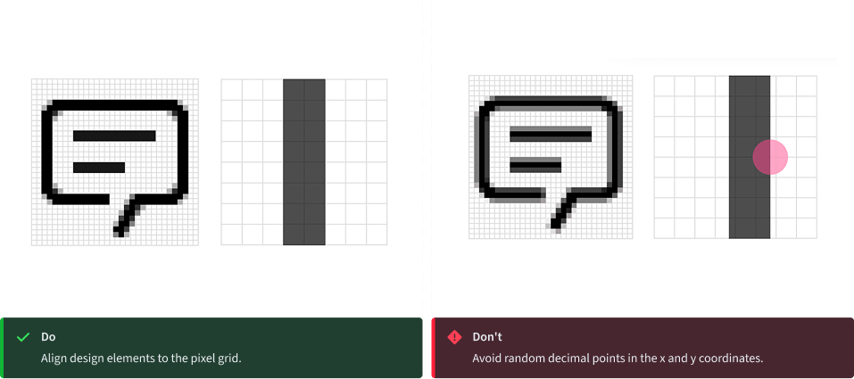
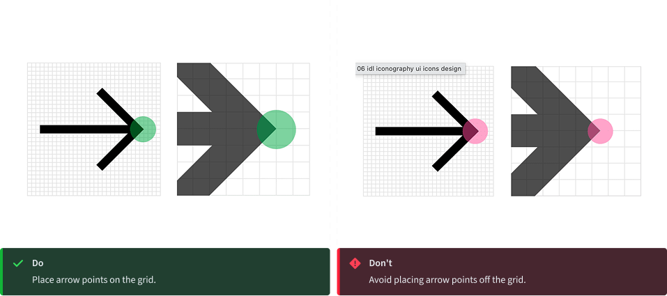
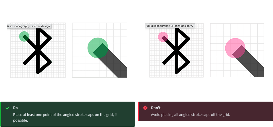
Progress Infra icons are drawn on a pixel-based grid of 32px x 32px and scaled down linearly to different sizes. Use the grid as your basic guideline to snap the artwork in place. We recommend fine-tuning adjustments for the shape you are trying to achieve during creation.

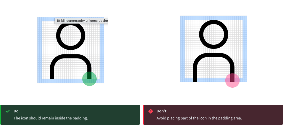
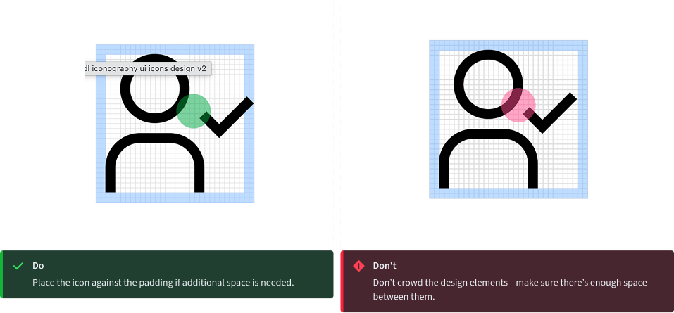
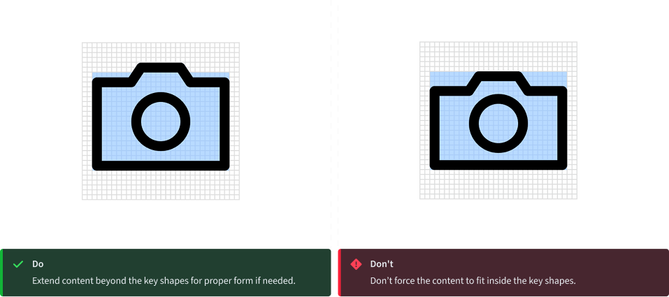
Padding
The grid contains 2px padding. This ensures icons will retain their desired scale and surrounding white space when exported. Only extend artwork into the padding for additional visual weight or for specific details required to define the shape’s content, meaning or character.
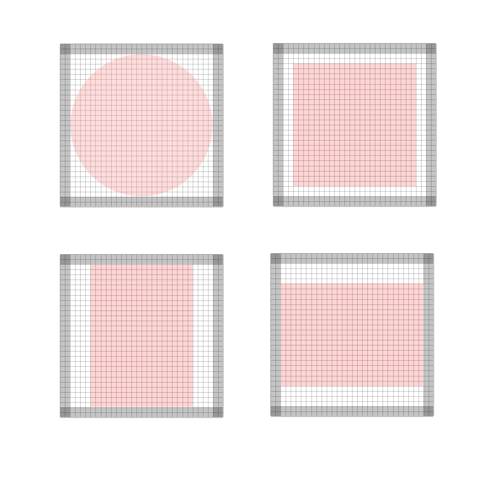
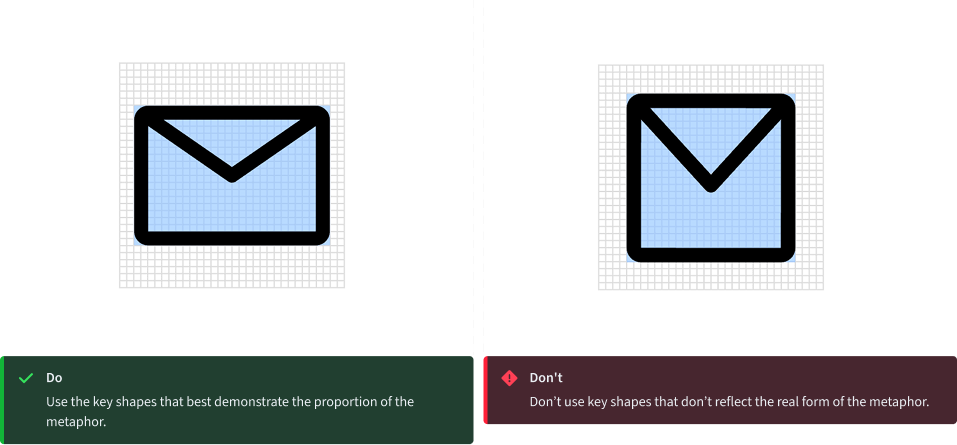
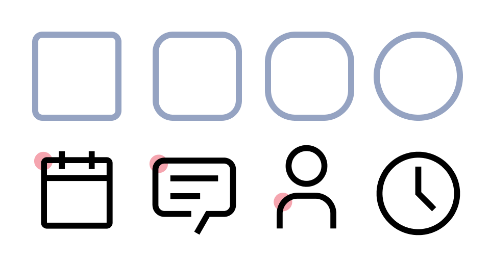
Key shapes
Key lines give you consistent sizes for basic shapes or proportions across the icon set. This makes it easier to create a visually stable foundation and helps to establish relationships between the similarly proportioned icons and the objects or ideas they represent.
Style
The stylistic conventions of Progress Infra icons deliver a meaningful bond with our typeface Source Sans 3®. Each icon is intentionally designed to harmoniously pair by sharing distinct details and characteristics found in the letterforms. The video below demonstrates some of these relationships between icons and letters, which allows them to fit well together visually.
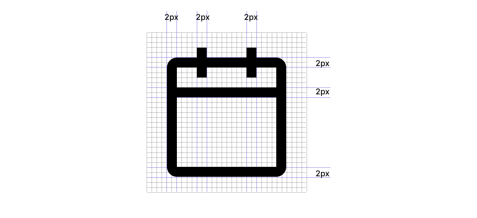
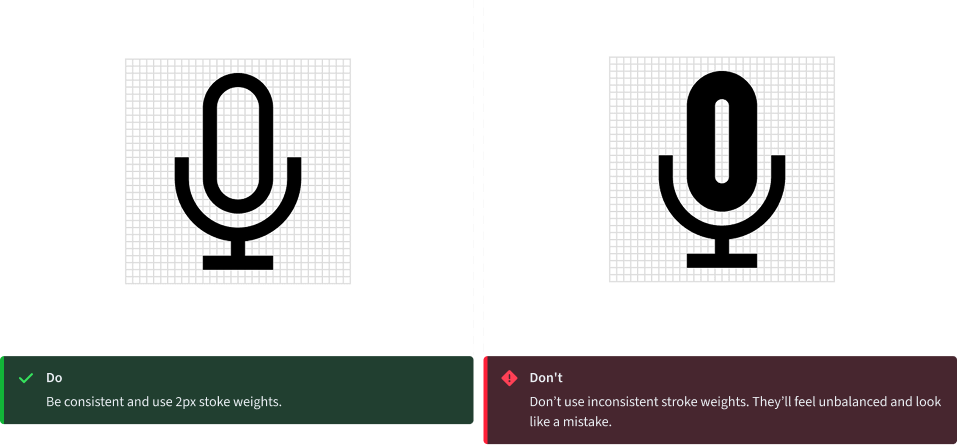
Strokes
One icon should not look heavier or lighter than other icons of the same size. Nor should there be different weights within one icon. Maintain the same visual weight by using a 2px stroke for all icons. There are a few exceptions to this rule which occur when the icon is complex or has a certain density of line. See examples shown here.
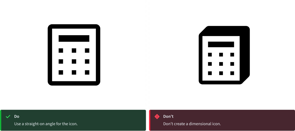
Perspective
The Progress Infra icons are designed and ready to use. However, if creating a new icon to contribute to the library, please be sure to avoid dimensional representations. Use more objective vantage points that are straight-on, or profile views.
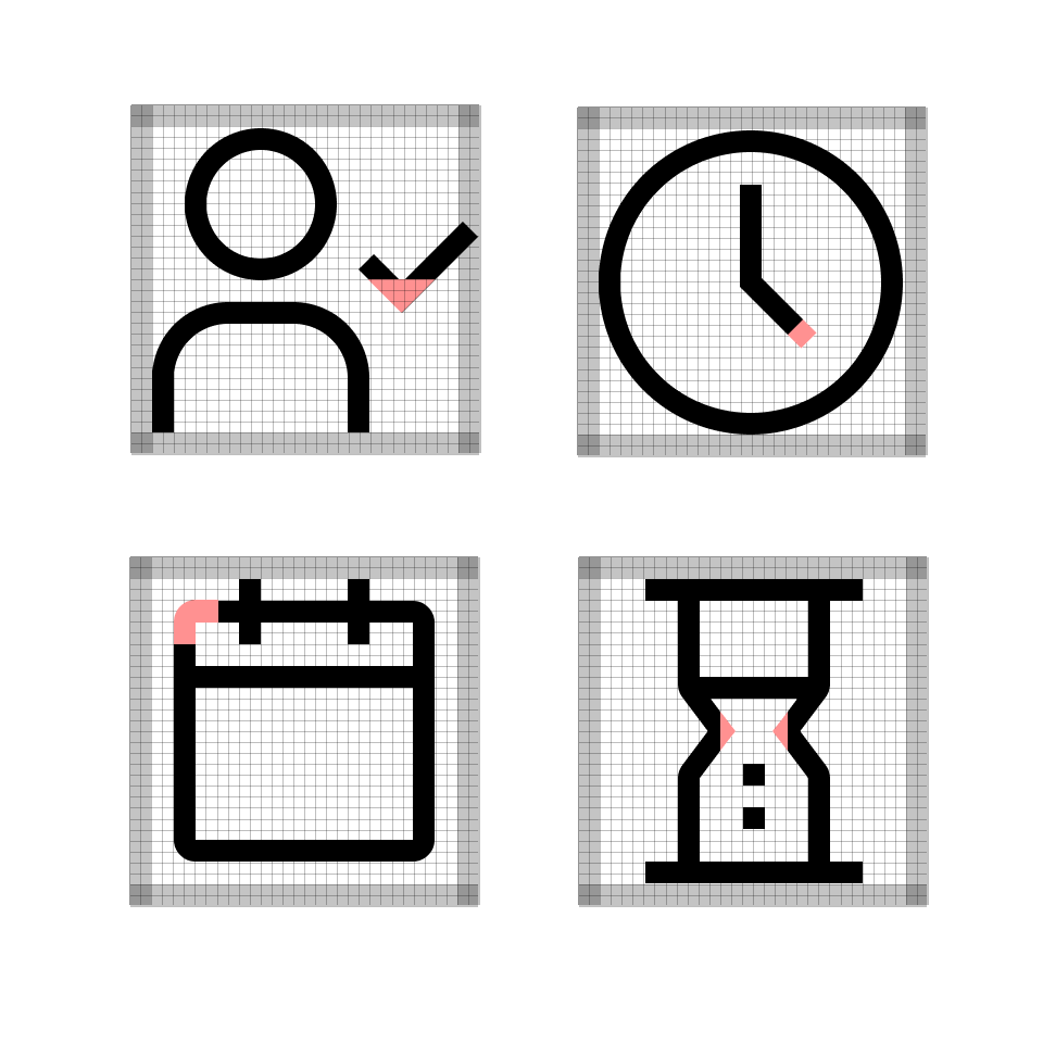
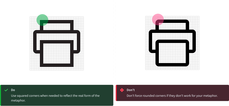
Corners
Use a consistent corner radius of 2px for rounded shapes. The 2px radius can be increased by a multiple of two when necessary to make the icon’s metaphor understandable or object shape clearly defined. Use an additional radius to make the metaphor reflect the real form of the object.
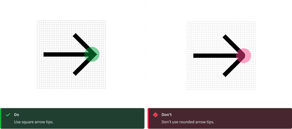
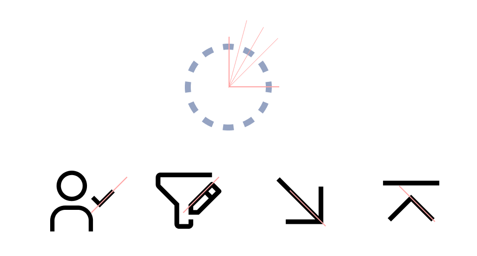
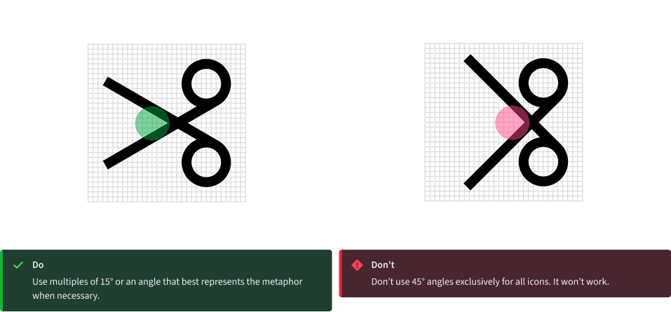
Angles
Use 45° angles for even anti-aliasing. Use increments of 15° whenever possible for other angles needed to best depict the shape you’re creating for your metaphor. You can create harmony across the icon set by consistently making angles sit on the same increments.
Thank you