Notification
Warning
This is a page in draft and has not yet been edited or approved
It’s important to keep users informed and send notifications when there is an update or status change they should be aware of. Users should always be given appropriate and timely messages to help them understand whether they are moving towards their goal. Ensure your notifications are relevant, timely, and informative. Variants of notifications
- Toast,
- Form inline
- Field inline without actionable.
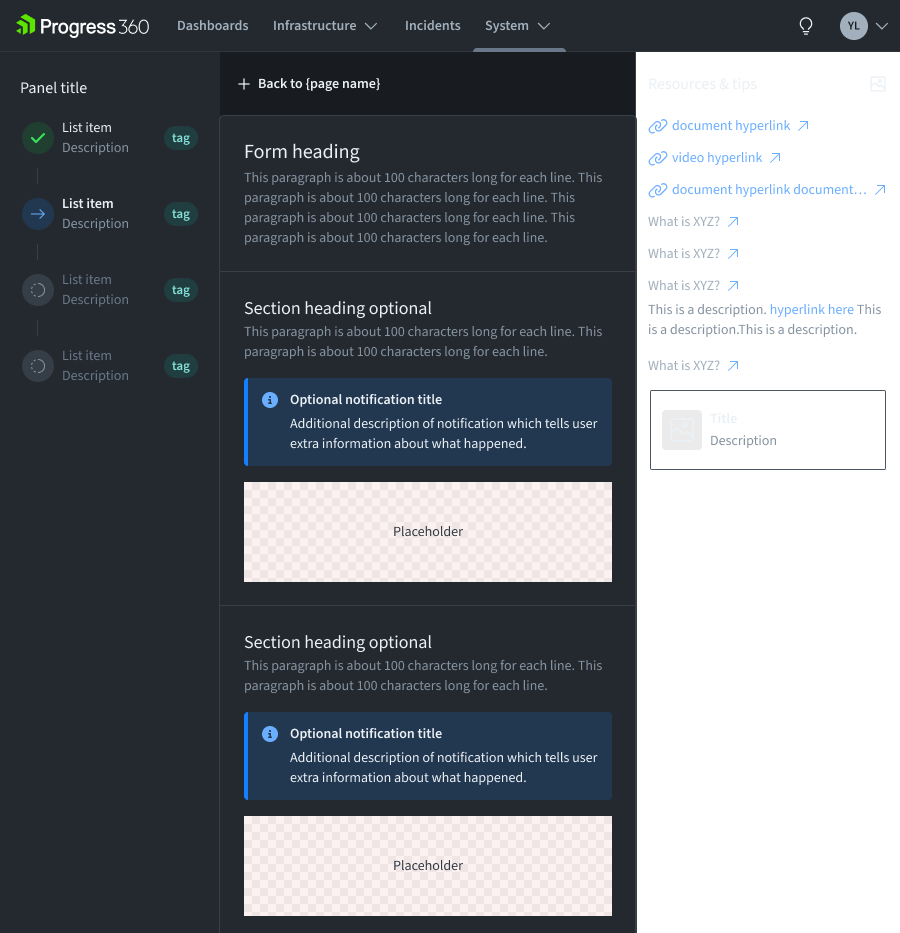
Usage
Demo
Overview
Notifications provide a method for communicating with users and sharing feedback. Their status signifies the purpose of the information being conveyed and allow you to tailor the disruptiveness of the notification to the specific situation.
Use notifications to inform users of updates or changes to system status. Communicating with users and providing immediate feedback are important for building trust. While notifications are an effective method of communicating with users, they are disruptive and should be used wisely.
Varient
Formatting
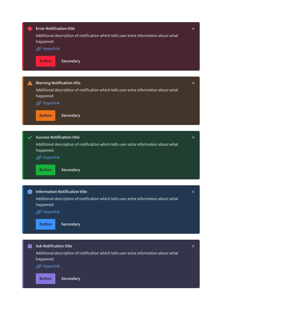
Anatomy
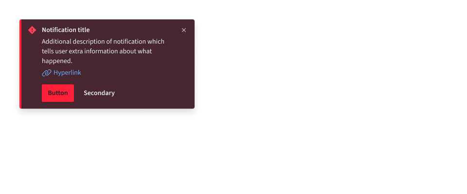
- Toast
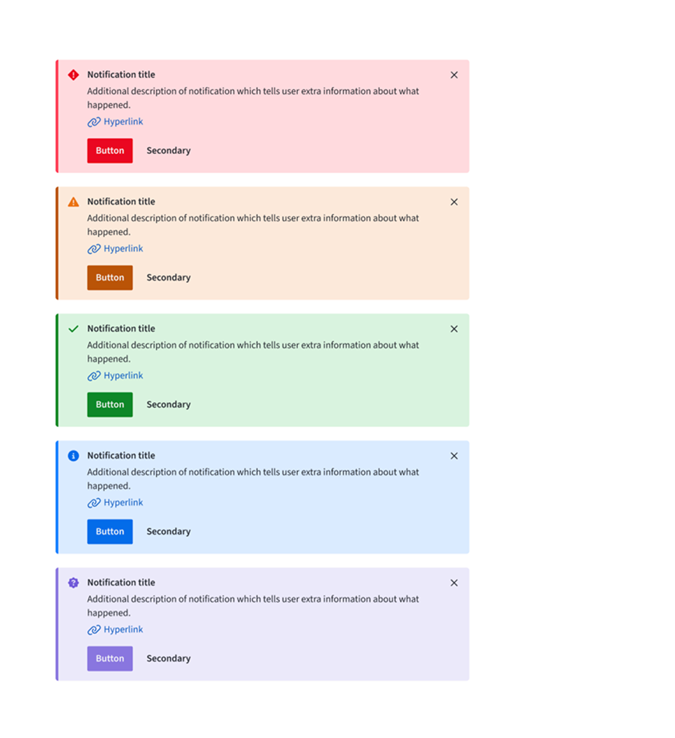
A. Icon
B. Title
C. Body Content
D. Close Button
E. Link
F. Action Button
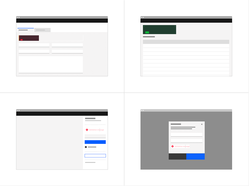
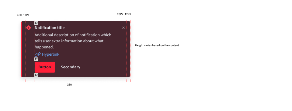
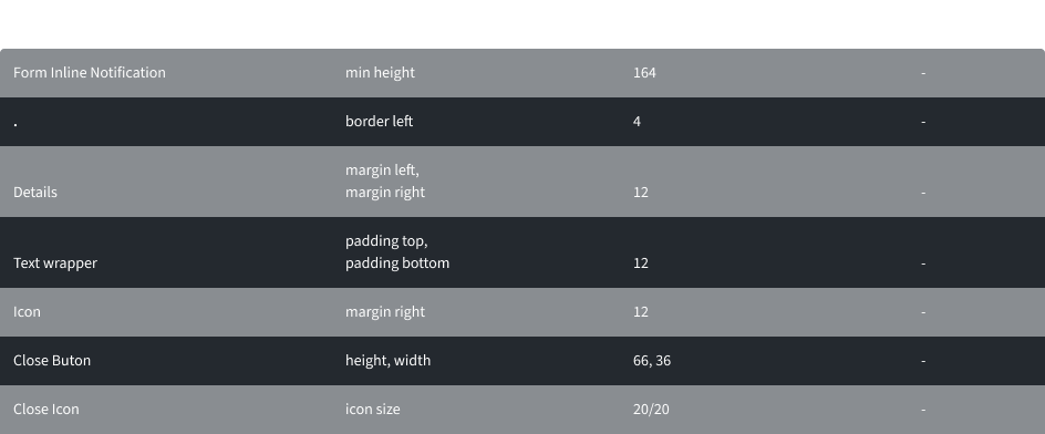
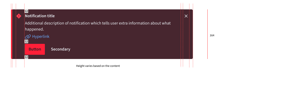
- Form Inline Notification
A. Icon
B. Title
C. Body Content
D. Close Button
E. Link
F. Action Button
- Field Inline Notification
A. Icon
B. Title
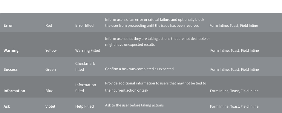
Notification Status
Notification statuses are designed to convey the emotional tone of the information being communicated. Each status is associated with a specific color and icon, ensuring a consistent and universal user experience
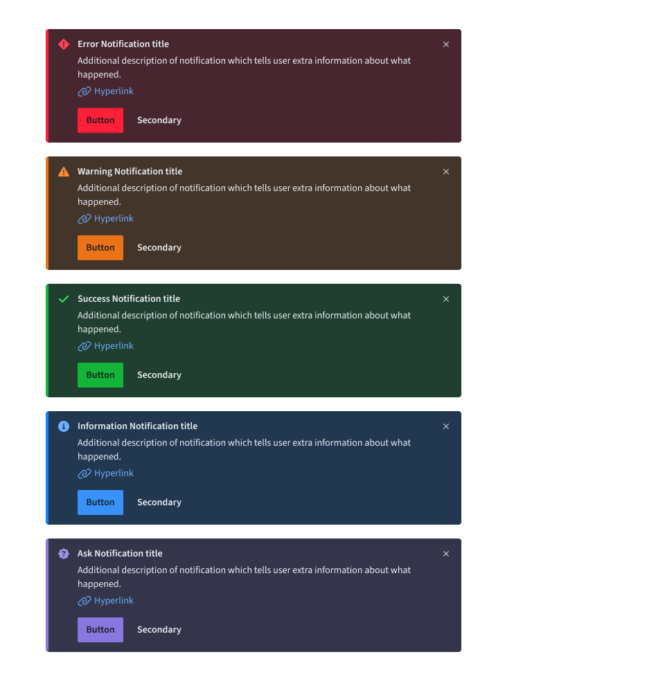
Deciding what to use
When choosing between the various notification statuses, consider the context and the emotion that needs to be conveyed. All notification variants, except for callout, typically serve as feedback after an action or task is completed. The callout variant is unique, as it provides guidance before users begin a task or take action and, therefore, does not include success or error statuses.
Content
Notifications provide limited space for content and, therefore, the content must be short and concise. Follow the guidance in Infra Style messages and write the message so the user can, by scanning the notification, be apprised of the situation and quickly know what to do next.
Main Element
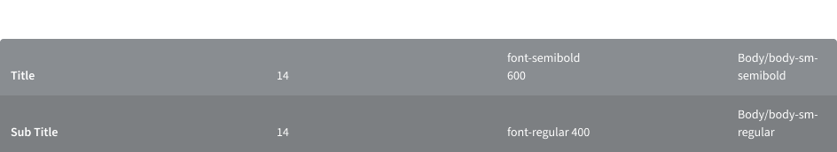
Title
- The title should be short and descriptive, explaining the most important piece of information. For error messages, tell users what stopped or can’t be done in the title, for example “Server instance unavailable”.
- Don’t use a period to end a title.
- When using rich text, such as in a title, a screen reader will read aloud the entire message as one sentence. Because the message will be read as one string, do not depend on text styling to convey meaning.
Body content
- Be concise; limit the content to one or two short sentences.
- Don’t repeat or paraphrase the title.
- Explain how to resolve the issue by including any troubleshooting actions or next steps. This is what Infra Style calls the “user action”. User actions are mandatory for error messages.
- When possible, use an actionable notification and include links in the notification body that redirect the user to where they can resolve the problem.
Action button
- Keep labels concise and clearly indicate the action the user can take.
- Limit action labels to one or two words. For a list of recommended action labels.
Link
- They must be descriptive and meaningfully indicate the link’s destination.
- They don’t necessarily have to be at the end of the sentence—they can also be within the body content.
Overflow
If a toast or inline notification requires a message that is longer than two lines, use an actionable notification and include a short message with a “View more” link that takes the user to a view of the full notification message. This destination can be either a full page with more details or a modal.
Inline
Inline notifications show up in task flows to notify users of the status of an action or system. Inline notifications usually appear at the top of the primary content area or close to the item needing attention.
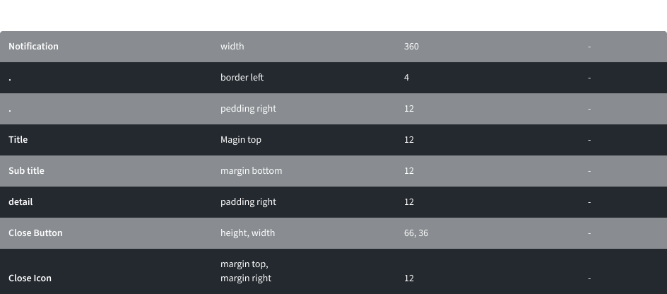
Sizing
The width of inline notifications varies based on content and layout. They can expand to fill the container or content area they relate to. Their height is based on the content length, which should not exceed two lines of text.
Placement
Inline notifications appear near their related items. They can expand to fill the width of the container or content area they are in and should align with the grid columns. Place inline notifications at the bottom of forms, just above the submission and cancel buttons. When error notifications apply to individual text inputs, they should supplement the error state on that specific input field.
Dismissal
Inline notifications do not dismiss automatically. They persist on the page until the user dismisses them or takes action that resolves the notification. A small “x” in the top right corner is used to dismiss inline notifications. Including the close button is optional and should not be included if a user must read or interact with the notification.
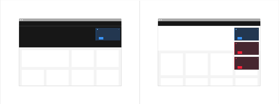
Toast
Toast notifications are non-modal, time-based window elements used to display short messages; they usually appear at the top of the screen and disappear after a few seconds.
Sizing
Toast notifications use a fixed width and their height depends on the length of the notification message. As noted in the content guidelines, limit toast notifications to two lines of text.
Placement
Toast notifications slide in and out from the top right of the screen. New toast notifications should appear at the top of the list, with older notifications being pushed down until they are dismissed.
Dismissal
Toast notifications persist by default, but they can timeout and be coded to dismiss automatically after five seconds on the screen. They can also include a close button so users can dismiss them sooner. Toast notifications cover content on the screen so they should always be easily dismissed. Because toast notifications can dismiss automatically, users should be able to access them elsewhere after the toast notification disappears if they need more time to read the notification or who want to refer to it later.
Universal Behaviour
Interactions
Mouse
To close notifications, one can either press 'Enter', press the space bar while focused on the X icon, or use the Esc key.
Keyboard
To close notifications, one can either press 'Enter', press the space bar while focused on the X icon, or use the Esc key.
Style
Color
Low Contrast
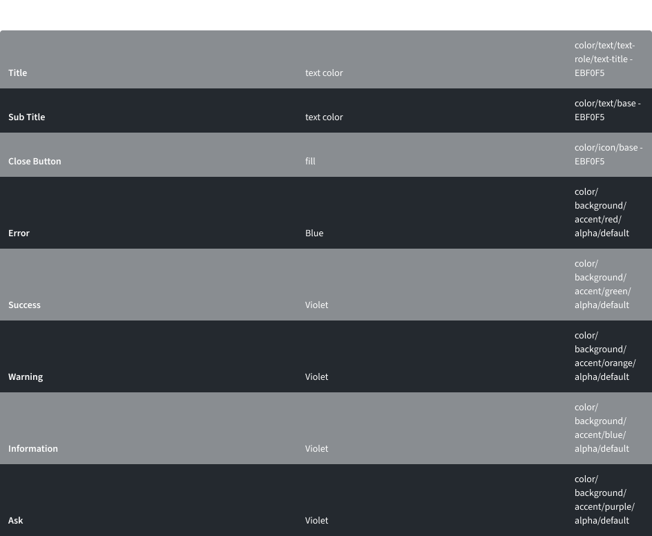
High Contrast
Typography
Write notifications in sentence case, which means only the first word is capitalized. Notification titles should be concise and to the point.
Structure
Toast
Form Inline
The width of an inline notification will vary based on content or layout.
Thank you!